LIQUOR LOCKER
Timeline -12 Weeks
Role: User Researcher, UX/UI Designer, Interaction Designer and Videographer
Tools: Figma, Adobe Illustrator, Adobe Photoshop, Adobe After Effect, Marvel & Sketch
Team: Olivia Morley/Taegan Baxter/Julia Boylan /Monica Mediarito
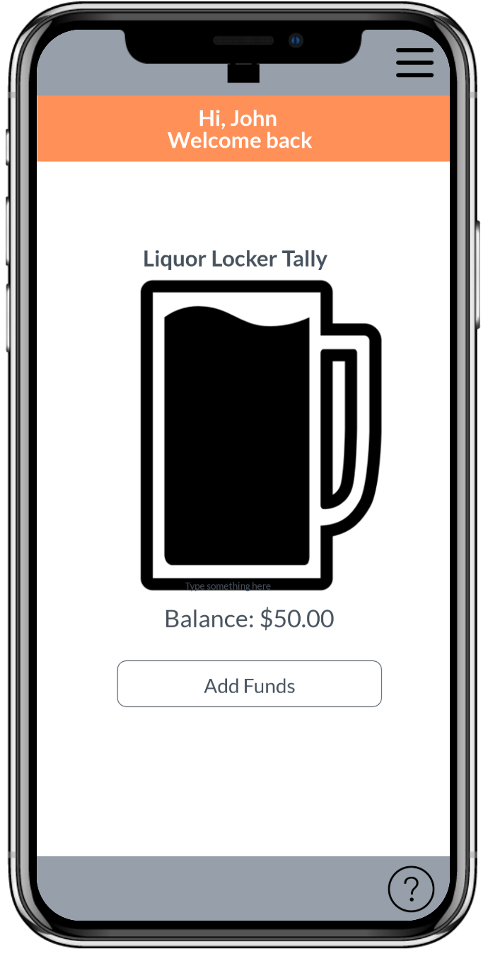
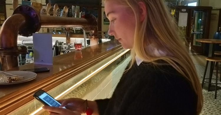
The Liquor Locker app also doubles as a budgeting app, with incentives and goals being set by the user. These goals such as “a trip to Bali”, or a “new pair of shoes” are added into the app, where the user is able to track their progress toward their goal. These incentives serve as constant reminders to intoxicated users that they can save their money for what they really want, in turn attempting to reduce their money spent on alcohol and inadvertently not binge drinking whilst doing so.
DESIGN CONCEPT VIDEO
OVERVIEW OF THE PROCESS
DISCOVER
OVERVIEW
RISKY BEHAVIOUR
A vast 26.2% of survey respondents confirm they have participated in the act of drink driving. Statistically speaking, this puts over 1 in 4 young adults in the harm of driving accidents as users explain that in certain circumstances, they decide to be an intoxicated driver. Alongside this, peer pressure is invariably present as drinking environments usually instigate risky behaviour. This includes the encouragement of binge-drinking and becomes evident within the statements of user research. One young adult reveals, “I didn't feel great and my friend forced me to do a shot, I felt a little attacked”.
A high prevalence in the excess consumption of alcohol has been identified as a high priority issue through our team’s investigation of young Australians. From an extensive sum of insights, key themes were identified through both the analysis of survey and interview responses. These methods were utilised in order to gain a deep insight into our users and their perspective on the problem scenario. Therefore, the synthesis of these themes emphasised a strong correlation between Australia’s drinking culture and the drinking motives of young adults. Determining practices of ‘tradition’ by past generations and the media, with the aftereffects including early exposure to alcohol, underage and binge drinking.
Furthermore, the occurrence of celebration between young adults and alcohol results in neglect about the consequences that coexist. These consequences concern vital lifestyle factors such as physical health, risky behaviour and affordability which can prevent young adults from a healthy and balanced relationship with alcohol. In context, the analysis of observational methods were found to support these ideas as it confirmed the prodigal behaviour of users within a drinking environment. Therefore, the analysis of key insights are as follows:
AFFORDABILITY
Within multiple interview sessions, target users express their concerns about the amount being spent on alcohol weekly, ranging from $30 - $200+. This prevents users from achieving their desired goals such as shopping for clothing or food items or putting the money toward savings as ideal alternatives.
PHYSICAL HEALTH
Organ damage, loss of brain cells and weight gain were the common responses of young adults regarding the consequences of regular alcohol use. Although when asked to elaborate, participants were unable to articulate a strong response. This highlights the inattentiveness toward the extent of health consequences, overlooking the long-term costs that apply. Additionally, 50.8% of survey respondents confirm using illegal drugs while under the influence of alcohol. This further illustrates the current scope of problematic alcoholism as it lies within the intent of its users.
DESIGN
OVERVIEW
TICKQUILA
Our team began to rapidly ideate various concepts before narrowing in on a select few and creating journey maps, personas and storyboards. These methods helped to define the user requirements and to explore ways in which we can best answer our problem scenario and overall goal for this project.
Our team began to rapidly ideate various concepts before narrowing in on a select few and creating journey maps, personas and storyboards. These methods helped to define the user requirements and to explore ways in which we can best answer our problem scenario and overall goal for this project.
LIQUOR LOCKER
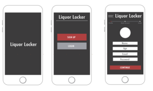
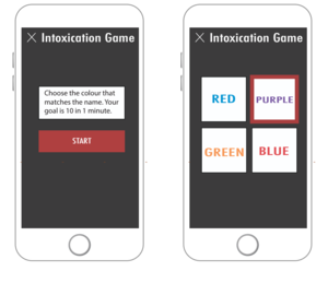
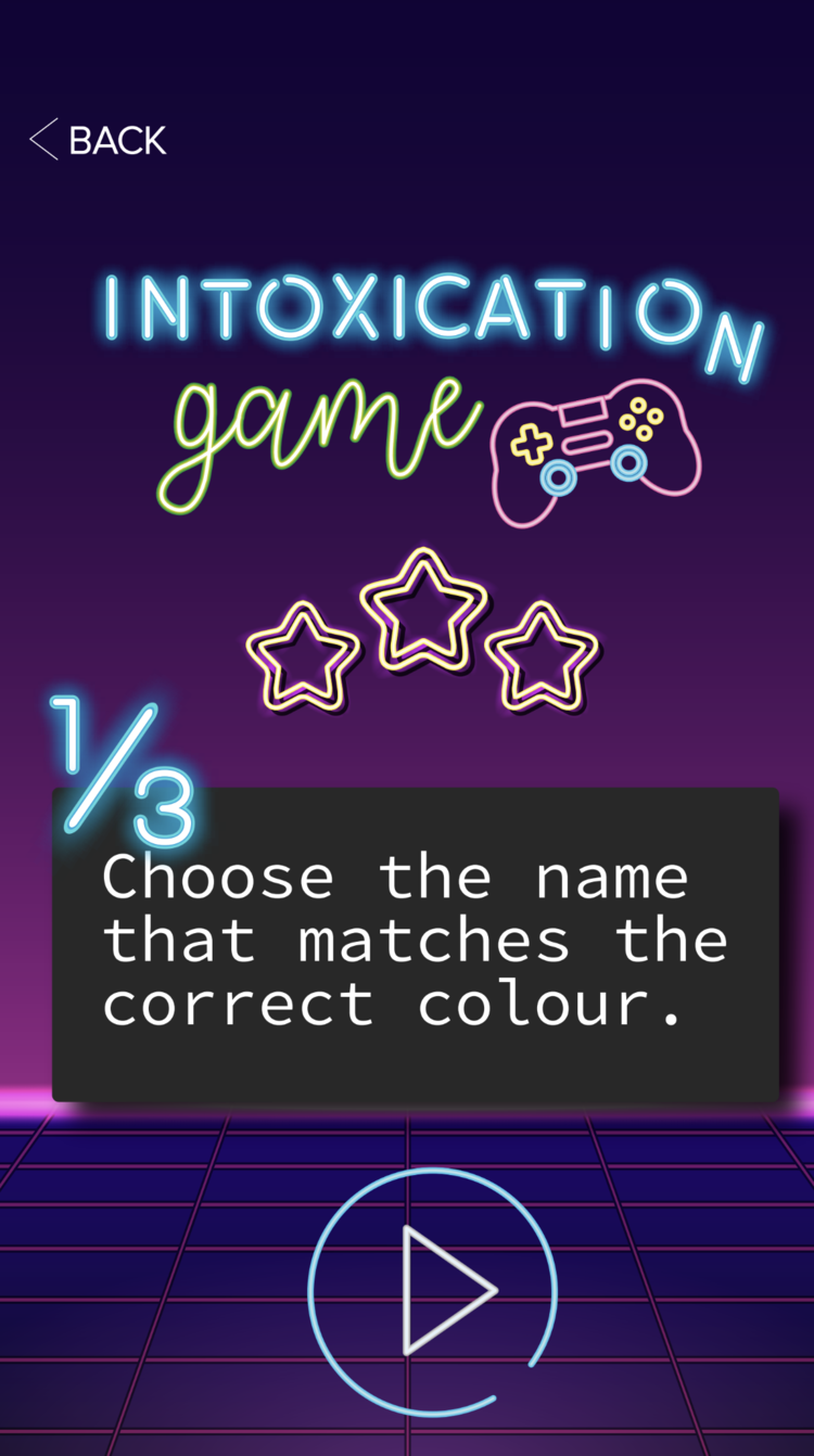
Liquor locker is an app that attempts to reduce young adults spending on alcoholic beverages. With gamification and personal goal implementation, the user is able to set their spending and destinations for the night prior to consuming alcohol. If the user attempts to go over their credit for the night, they are then required to play a game testing their cognitive recognition. If they are too intoxicated they will not pass and are thus not able to unlock more funds, if they win and are sober they can add incremental funds to their account.
BACARDI
Within multiple interview sessions, target users express their concerns about the amount being spent on alcohol weekly, ranging from $30 - $200+. This prevents users from achieving their desired goals such as shopping for clothing or food items or putting the money toward savings as ideal alternatives.
STORYBOARDS, PERSONAS, USER JOURNEY MAPS & WIREFLOWS
DEVELOPMENT
CHOSEN CONCEPT
LOW-FIDELITY PROTOTYPES
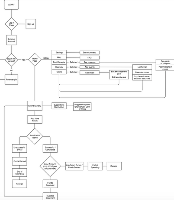
LOW FIDELITY UI FLOW CHART
Our flow diagram was initially conducted on a white board. The purpose of showing the entire functionality and flow of our design from start to finish was to highlight key and important stages within our interfaces.
Through the process of methods such as the decision matrix and heuristic analysis, Liquor Locker App was chosen as it fulfilled the most desired idea on which to satisfy the brief.
Through our research we identified one single core aspect that steered us in this direction, many young people simply do not care about the physical effects or risks associated with drinking. As such we attempted to find an incentive specifically appealing toward our target demographic, the promise of saving money. In an attempt to appease the core theme of “monetary expense related to alcohol” we have concluded that this is one of the most efficient and motivating factors toward reducing excessive drinking among young adults. Whilst maintaining the important aspects of our previous design brief and criteria to evaluate success, we as a design team believe that redesigning this problem area to one that focuses on a major motivator in reducing excess drinking, has the ability to therefore reduce the negative consequences associated with it.
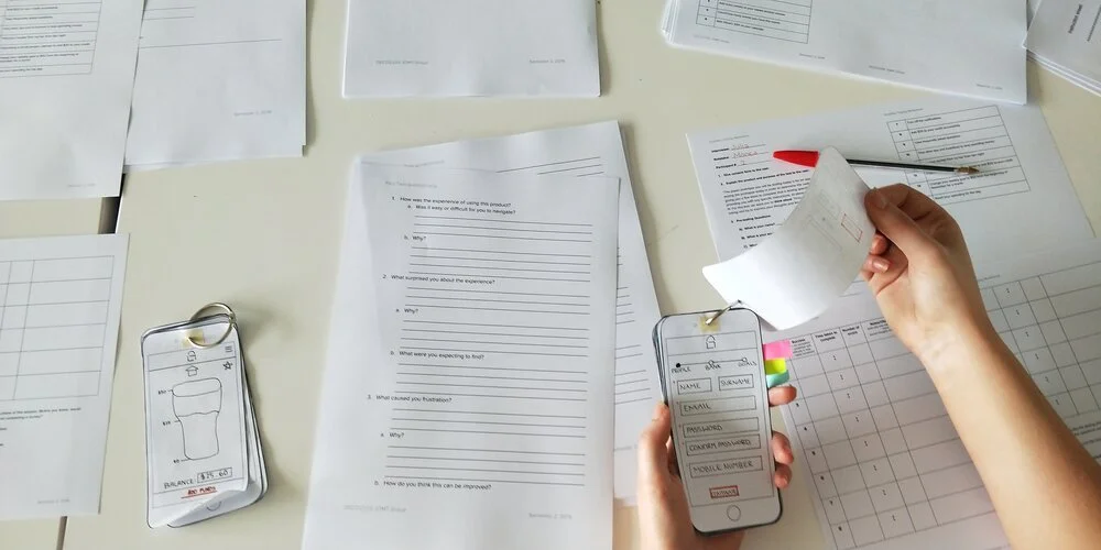
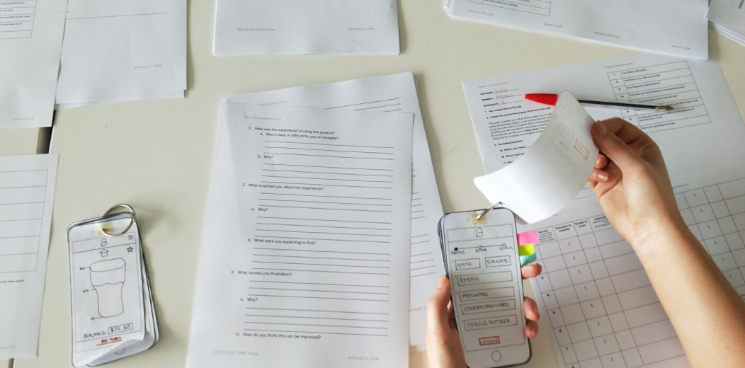
Our Low-Fidelity 1.1 prototype was created with paper, pens, sticky notes and masking tape. In the “..world of digital design, we have a lot of different tools that make the process of prototyping easy, this includes simply a pen and paper…” (Babich, 2018).
Paper prototyping can be extremely useful in the early stages of user interface design. It allows for the screen navigation, the layout of the screens and what interfaces are found to be engaging and beneficial to the application itself
MID-FIDELITY PROTOTYPES
Our Mid-Fidelity prototype 2.1 was created on the design tool of Marvel. Marvel is an industry approved application that allows for an all-in-one platform of developing digital products especially that of apps. This tool was essential to use as it allowed for a digital aspect to be introduced into the prototyping stage of this project.
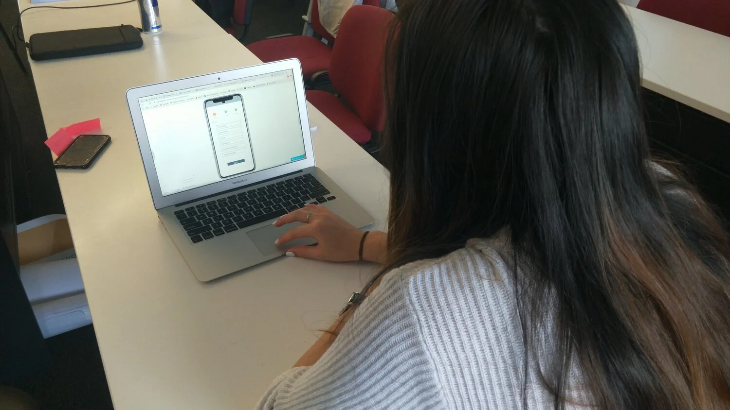
This iteration allowed us it further edit interfaces and emphasise the errors that arose surrounding the functionality of the interfaces themselves. Similar to that of iteration user testing one, participants where given goals and tasks to achieve while navigating through the interfaces. For our initial round of think aloud testing in which we tested our initial design of Liquor Locker, we wanted to focus on the users emotional, physical and cognitive response to the designs. Thus, we largely focused on observations and our post-interview stage of our user testing. This stage was essential in determining their frustrations and opinions of this application during and after their experience. After analysing the results from this process, we where able to determine what beneficial aspects of the interface we should keep and essentially what we should change.
Mid-Fidelity 2.2
In order to increase the fidelity of our prototypes, a second mid-fidelity iteration (2.2) was created, specifically working on the game aspect of the app. This Using sketch, our design team created a handful of screens at mid fidelity level in order to get close to the user wants and needs.
Drawing from our original neon bar inspired theme, this iteration attempted to essentially “gamify the game” and give the app a more colloquial feel, that was lacking in past iterations. In saying this, we only tested this fidelity with a handful of individuals using very illegitimate think aloud method. This enabled us to gather information quickly from a small sample of people.
Mid-Fidelity 2.3
In an attempt to create screens that were more professional and less “gamey”, our design team iterated on previous designs and created what is now our Mid-fi 2.3 screens. Like the 2.2 screens, these were designed for key features, however instead of the game, we focused on sign up and creating events. This fidelity, was initiated using a brand guide, a set of font families and a colour pallet. Then each team member went away and designed a set of screens. Using this method allowed us to ideate without the distraction and influence of other opinions. However in saying this, it resulted in vastly different screens and in hind sight should have been done prior. Again users were tested quickly, and insights were drawn rapidly. This ensured that we could gather data and insights with enough time to iterate before creating our final mockups within the time constraints.
MID-FIDELITY- UI Flow Diagrams
Our mid fi flow diagrams, depict the process and navigation elements of the mid fi marvel prototypes.
These diagrams were created using flow.io, and visually represent the mid fi navigation.
This version of the page layout, also helped when creating our mid fi prototype, enabling our team to visualise what areas needed to be “hot spots” in order to create a semi functioning application for testing.
HIGH-FIDELITY PROTOTYPES
In an attempt to create screens that were more professional and less “gamey”, our design team iterated on previous designs and created what is now our Mid-fi 2.3 screens. Like the 2.2 screens, these were designed for key features, however instead of the game, we focused on sign up and creating events. This fidelity, was initiated using a brand guide, a set of font families and a colour pallet. Then each team member went away and designed a set of screens. Using this method allowed us to ideate without the distraction and influence of other opinions. However in saying this, it resulted in vastly different screens and in hind sight should have been done prior. Again users were tested quickly, and insights were drawn rapidly. This ensured that we could gather data and insights with enough time to iterate before creating our final mockups within the time constraints.
Our next iteration, High-fi 3.1, focused on usability heuristics and the functionality of the application in order to create an efficient application fit for purpose. Again these screens were created, focusing mainly on the game aspect of the application, and seemed somewhat unprofessionally. The interface design of these high fi screens, again created using sketch, allows us to experiment with creating a more “sophisticated” look, moving away from the cartoon neon animation and going for something that better fit the demographic. Taking away the neon lights, as well as experimenting with other aspects such as calendar and activity, we attempted to find a good balance between age appropriate, and ensuring our app had a form of personality. As such these iterations attempt to satisfy that. Testing was conducted with 6 participants, and a think aloud method was used.
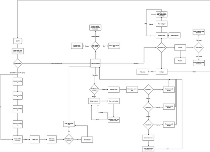
HIGH-FIDELITY- UI Flow Diagrams
High fidelity flow diagrams were also created once our application flow was finalized for the high fidelity prototype.
This diagram, like others, depicts the functionality of the app at the given fidelity. This allowed our team to visualise the paths taken at the final level by the user, ensuring all paths were then emulated in the wire flow and final prototypes for testing.
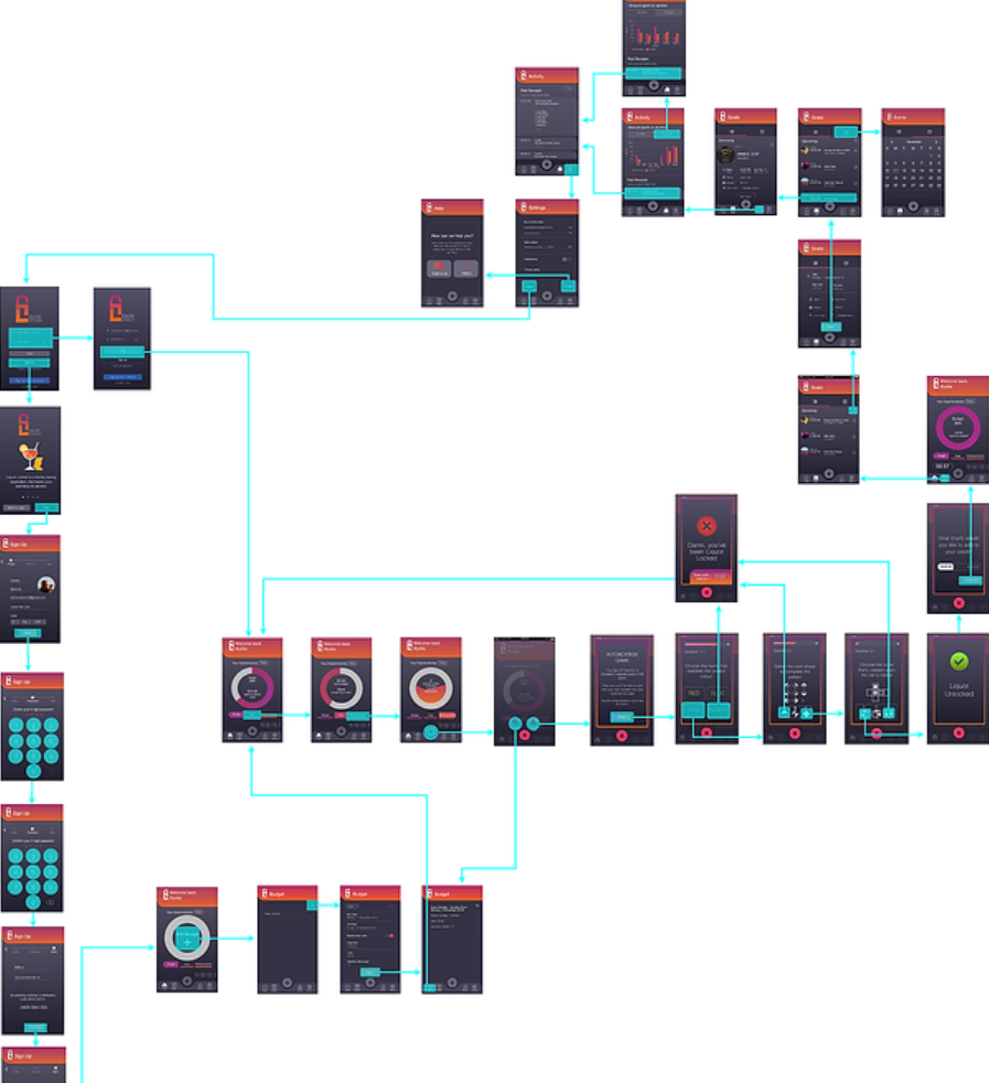
MOCKUPS
Our high fidelity wire flows depict the navigation and hierarchy of our application at the high fi level. This combination of flow diagram and wireframe were created with flow.io and allowed our team to visualize the steps taken by the user whilst completing various tasks in the application. It must be noted that we did not include all screens in this diagram, rather the main points for clarification and simplicity (see appendix for further images). It has been modified from our original wire flow, due to user feedback. Examples of things changed, including the implementation of a navigation bar placed at the bottom of the screen. This dictated most user interaction with the interface. The naming conventions of categories were also iterated.
