CLIMATE TRUTHS
Timeline: 13 Weeks
Role: Coder, UX Designer, UI Designer & User Researcher
Tools: Figma, Adobe Suite (Illustrator, Photoshop)
Team: Olivia Morley/Mietta Reed
Climate Change is “our greatest threat in thousands of years” (Attenborough, 2019). While there is overwhelming scientific agreement on climate change, the public has become polarised over fundamental questions such as human-caused global warming (Cook, 2019). Communication strategies to reduce this polarisation rarely address the underlying cause: ‘ideologically-driven misinformation’ (Cook, 2019) streamed through outlets such as social and mainstream media.
It all begins with an idea. Maybe you want to launch a business. Maybe you want to turn a hobby into something more. Or maybe you have a creative project to share with the world. Whatever it is, the way you tell your story online can make all the difference.
Don’t worry about sounding professional. Sound like you. There are over 1.5 billion websites out there, but your story is what’s going to separate this one from the rest. If you read the words back and don’t hear your own voice in your head, that’s a good sign you still have more work to do.
Be clear, be confident and don’t overthink it. The beauty of your story is that it’s going to continue to evolve and your site can evolve with it. Your goal should be to make it feel right for right now. Later will take care of itself. It always does.
OVERVIEW OF THE PROCESS
PROBLEM
SOLUTION
Misinformation and communication on the Topic of Climate Change in Australia for those aged 18-30
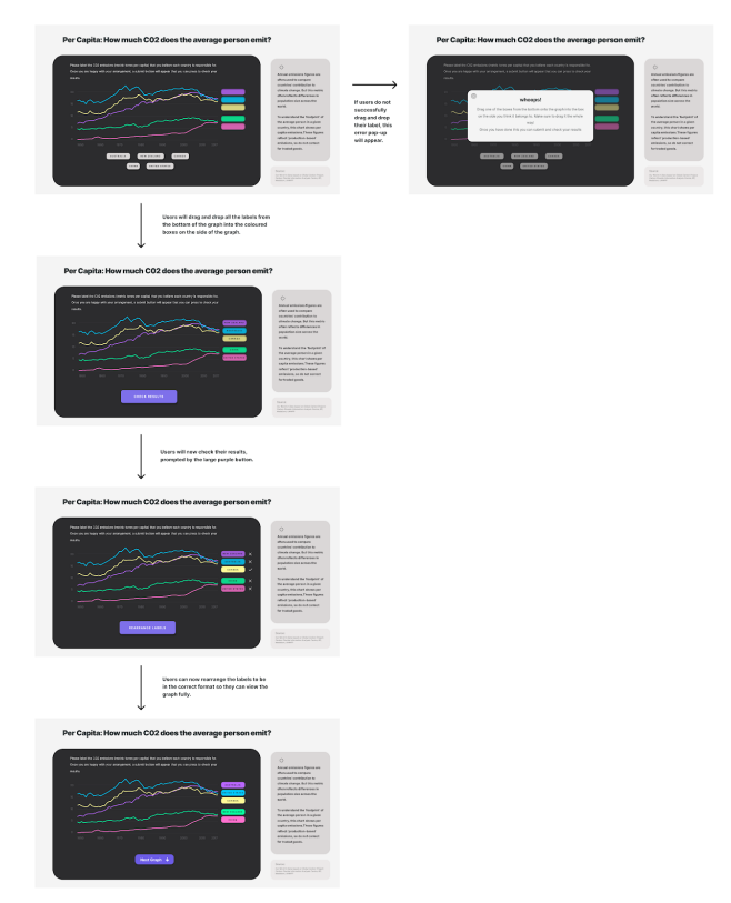
The solution; an engaging, interactive and accessible website which provides unbiased information on Australia’s involvement and impact on climate change. Midnight Designers are creating a website for users aged 18-30 which allows them to educate themselves on Australia’s positioning amongst other countries in C02 Emissions and how energy is consumed in Australia. The education is achieved through a unique interaction between the user and the data. This feature is named the ‘drag & drop’ which involves users to drop the appropriate label they believe corresponds with the data, submit their answers and view the results. The result of having this level of interactivity is not only highlighted by the negative stigma around the topic of Climate Change in Australia but proves to the user the power in which ‘ideologically-driven misinformation’ (Cook, 2019) has on their prior knowledge. A tool which can be utilised in this case of misunderstanding of information is data visualisation. The use of images and graphs can aid in the universal understanding of information and can be a vital tool within this project.
DISCOVER
OVERVIEW
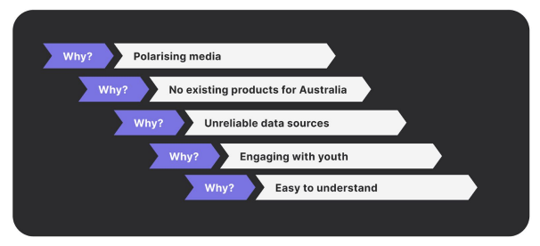
5 WHYS METHOD
Climate Change is “our greatest threat in thousands of years” (Attenborough, 2019). While there is overwhelming scientific agreement on climate change, the public has become polarised over fundamental questions such as human-caused global warming (Cook, 2019). Communication strategies to reduce this polarisation rarely address the underlying cause: ‘ideologically-driven misinformation’ (Cook, 2019) streamed through outlets such as social and mainstream media. This creates a boundary of uncertainty for users when trying to understand countries such as Australia’s involvement with tackling Climate Change. Thus, as a designer, it is important to highlight this prevalent issue that is inflicting tension and the opportunities of which can arise from this problem area. The solution; an engaging, interactive and accessible website which provides unbiased information on Australia’s involvement and impact on climate change. Midnight Designers are creating a website for users aged 18-30 which allows them to educate themselves on Australia’s positioning amongst other countries in C02 Emissions and how energy is consumed in Australia. The education is achieved through a unique interaction between the user and the data. This feature is named the ‘drag & drop’ which involves users to drop the appropriate label they believe corresponds with the data, submit their answers and view the results. The result of having this level of interactivity is not only highlighted by the negative stigma around the topic of Climate Change in Australia but proves to the user the power in which ‘ideologically-driven misinformation’ (Cook, 2019) has on their prior knowledge. A tool which can be utilised in this case of misunderstanding of information is data visualisation. The use of images and graphs can aid in the universal understanding of information and can be a vital tool within this project. Data visualisations are beneficial in many ways as they provide users with not only important factual information but a way in which to define and describe trends which are present in information. Thus, it is an important tool which can be utilised within design projects as it allows for opportunities such as usability testing to be explored. Usability testing is the process of methods which is designed to test how easy a product is to use for a group of users. The purpose of conducting this testing is to place iterations of a design in front of users to receive their attitudes, opinions and feedback on the functionality, design and overall purpose of a project. An aspect to note is that the interactive feature is known as ‘Drag & Drop’ was only tested amongst users in order for valid and reliable results for engagement and interactivity.
MARKET ANALYSIS METHODS
USER EXPLORATION AND DEVELOPMENT
LOW-FIDELITY PROTOTYPE
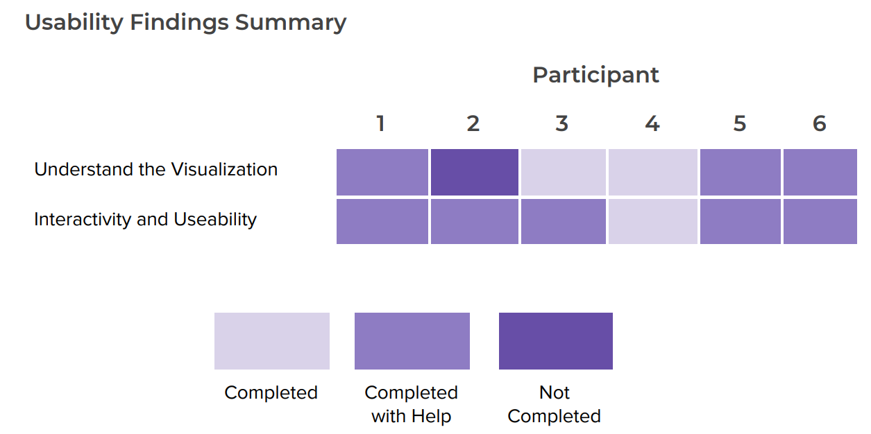
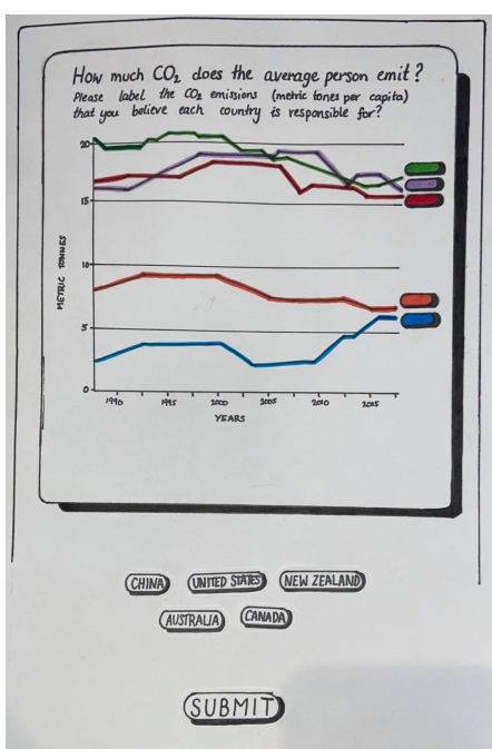
Low-fidelity prototyping is often made with paper allowing for tactile interaction between users and a product. “Paper prototyping is great for exploring design possibilities” (Lougmani, 2020) as they draw upon sketches that were used within earlier methods to create a prototype based on the designers first initial process of what the final product will essentially look like. It will be an essential tool in developing user functionality and process from the brainstorming aspect of this product. The initial stage of low-fidelity prototyping in this project focused on a functionality action for the website. This is due to the importance of interactivity in establishing the final outcome of which is being achieved. With ‘engagement with users (interactivity)’ being an important outcome criterion to evaluate, the low-fidelity user testing only focused on the feature of ‘Drag & Drop’ highlighting the process of which users can interact and understand the graphs that will be included into the final concept. This image shows the initial paper prototype presented and tested to users. Within testing, users participated in ‘Think-Aloud Protocol’ as well as Usability Testing where participants would engage in tasks to perform.
REFLECTION:
As a result of Low-Fidelity Prototyping, many pain points were explored and tested. Overall, the Low-Fidelity Prototype revealed many positive outcomes of the interactivity feature that will be included in the final website. The ‘Drag & Drop’ feature was tested the results reflected that the functionality and layout of the feature were easy to use and determined that this concept will be progressing in the next stages of prototyping. In the next stages of prototyping, the designs will transition into digital iterations and more usability tests and methodologies will be conducted to further advance the functionality of this project.
MID-FIDELITY PROTOTYPE
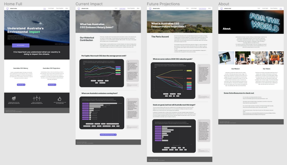
Medium (Mid)-Fidelity prototypes are a visual transition from paper product to a digital interface design. It is a prototype that limits the functionality but presents interactions and navigation possibilities within a digital form. The mid-fidelity prototype for this project was designed and created in Figma. Figma is an online resource that allows for prototypes to be brought to life with the possibility of testing the interactivity of interfaces from one to another
REFLECTION:
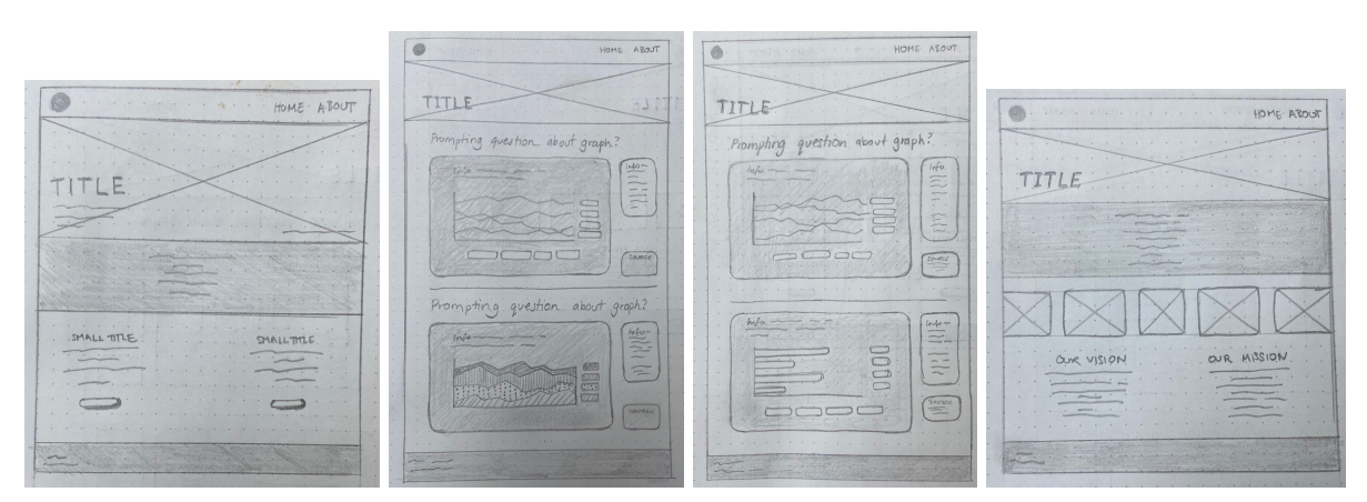
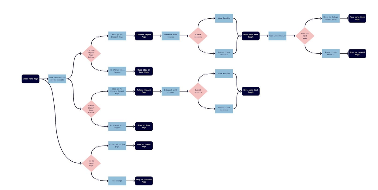
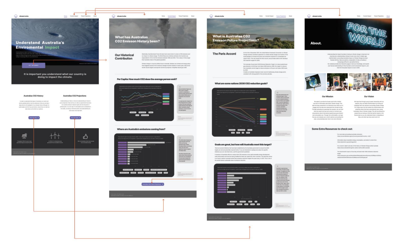
Mid-Fidelity prototypes allow for the exploration and examination of functionality to be displayed within a website. The user testing rounds allowed participants to direct themselves through the prototype and highlight essentially key attributes that need to be added or removed to aid the overall design of the prototype. Through the methodologies of wireframing and flowcharts, the mid-fidelity prototype functionality and design were able to be visually created. The benefits of wireframing were to design a product that was aesthetically pleasing as well as educational. That is why this method was chosen as it visually represents features and their size within the dimensions of a website. This method of exploration allowed for the basic layout of images, text, and key features to be placed within our website. The benefits of conducting a flowchart have aided this prototype as it allows for the journey of possible outcomes to be shown through decision-making. For this prototype, this method gained pain points, in adding and subtracting attributes to help the user’s experience be more clear and flow between interfaces.
METHOD EXPLORATION DURING USER TESTING
WIREFRAMES
FLOWCHARTS
HIGH-FIDELITY PROTOTYPE
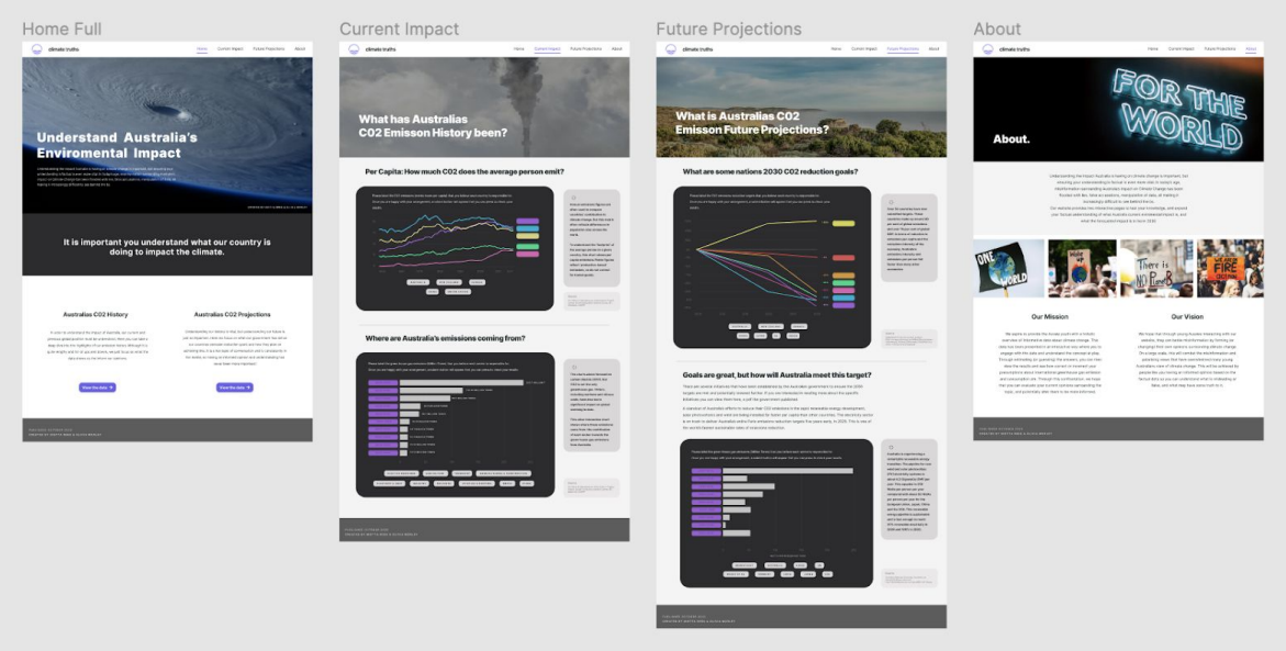
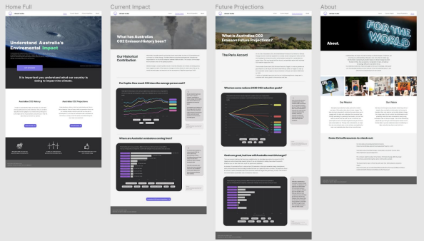
High-Fidelity Prototypes ‘is a computer-based interactive representation of the product in its closest resemblance to the final design in terms of detail and functionality’ (Ibragimova, 2016). This level of prototyping is essential in any design project when testing has reached a level of finalisation. The purpose of completing this level of prototyping is for final testing to be conducted and all of the feedback given from low to mid-fidelity to be implemented into the final design. Figure 11 is the final high-fidelity prototype made for this project. It can be viewed on Figma through the following link:
METHOD EXPLORATION DURING USER TESTING
WIREFLOW OF WEBSITE
WIREFLOW OF DRAG & DROP FEATURE
UI STYLE GUIDE
FINDINGS
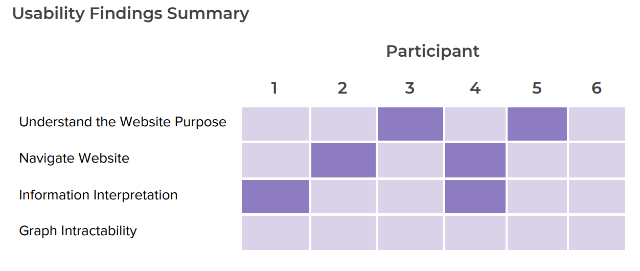
The key findings of user testing have aided in the development of design and functionality of this concept. User testing has allowed for methodologies and interactions to be implemented to aid in each stage of prototyping allowing for certain attributes to be added throughout the entire process of this project. Within testing participants, the flexibility of remote user testing aided the development of this concept both positively and negatively. A positive for limited participants meant that the same users were able to experience the progression of the concept into low, mid and hi-fidelity prototypes. Meaning that they could see their feedback being implemented at each stage of testing. A negative outcome of which this type of testing was brought, due to COVID-19 social distancing restrictions, is that there was limited exposure to the target audience. Thus, not many participants were able to be tested due to these laws being introduced for the safety of both participants and testers.
Low-Fidelity prototyping began with paper allowing for initial feedback and interactivity to be tested. It was important to only test the functionality of the feature that will not only engage the audience but provide informative information to the user. The attribute of ‘drag & drop’ was this feature that allowed for user’s to drag an answer to a position within a graph and drop it within the answer section. User’s responded positively to this round of testing commenting on how ‘easy’ the graph was and to understand. 97% of respondents within this testing group responded positively to this graph design and functionality. In addition to this, the mid-fidelity prototyping allowed for participants to experience an electronic outline of what the paper-prototype function will be and how it will be placed within a website interface. The user results from this testing allowed for further exploration into the functionality of a website and how it can be implemented within our specific feature of ‘drag & drop’. Features such as buttons, images and more text were added as a result of feedback. A major pain point gained by users while testing was whether when changing their answers on the graph, whether or not the original labels would move to another vacant spot or to down the bottom where the tags originated. Also when submitting their answers whether a total of numbers would be visible to see whether or not they are correct.
With all of this feedback, the high-fidelity prototype implemented 25 these aspects. In doing so, the hi-fidelity prototype made within Figma, added these features to improve the overall flow and design of this concept. An interesting aspect to consider with this concept was the overwhelming surprise of the vocal interest the users had in our product. Most comments during testing rounds responded positively commenting on the design, flow or understanding each participant experienced during testing. This was quite a surprise but allowed for the confidence needed to further projections this project. With further feedback from users and tutors, this concept can be further iterated. A factor to consider is the collection of data from participants to highlight the results amongst the target audience. The collection of this data can aid in truly highlighting the impact miscommunication has had on the topic of Climate Change in relation to Australia. With this finding as well, privacy and certain groups of people may or may not want to use this product. Further research and iteration will need to be conducted to see both the positive and negative attributes this idea creates. It is important to also maintain a neutral perspective on maintaining a single source of truth with the data.
IMPLEMENTATION PLAN
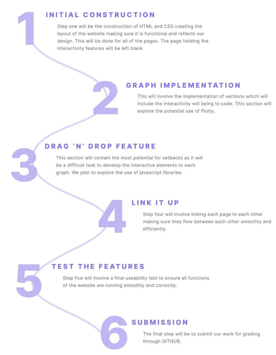
Plan which was followed to create this project
